I had the amazing opportunity to create the 2025 MAX branding. This was an amazing chance to recreate a new visual expression of the event. This years theme was all about perspective. Not only a literal perspective but also a perspective of the creative. We created a vast array of different elements that convey that messaging through visual design and exploration. Working side by side in a collaborative effort with the Adobe team to come up with this striking and bold approach. The work speaks volumes.
Another part of this project was to create a background that showed the depth of the Adobe experience. What we are calling “materials” we created this colorful background utilizing the adobe products. The static materials were created in Illustrator and Photoshop. The we brought them into Adobe Firefly to animate them.
Group Design Director: Zulema Orozco
Design Director: Dee Duncan
Senior Designer: Tracey Wong
Motion Designer: Alejandro Ussa
Canopy came to me for an illustration project. I took the brief and ran with it. Really having fun creating custom illustrations that represented CHICAGO at its best. The blue and red color draw inspiration from the Chicago flag.
The Brief:
- Retro cartoon with a modern flare. Think NYC Bodega graphics/text but… elevated?
- A collage of well known (and maybe a couple local easter eggs) imagery of Chicago. With at least one item being turned into a cartoon character
- Chicago dogs, deep dish pizza, the bean, sears tower, hancock building, river taxi, chicago flag, Mrs. O'Leary’s cow, etc etc.
- Loving the two color designs on a colored background in the examples below. Would prefer it to be more rough or sketchy than modern and sharp.
- The main graphic must noticeably say “Canopy Digs Chicago” and secondary text of various phrases would be cool. Must include the date “2023” somewhere.
- Would be so cool to have a sticker of the pack/sheet
Safe Stories is a campaign for Ad Council and End Family Fire. It’s a collection of stories of people who came close to gun suicide.
Outside of OOH and video, we created a 100 page book containing each story and at the end of the book is a built in gun safe.
I created a new brand Identity for my son’s CO-OP playgroup. I wanted to keep it really graphic and fun. Creating a vast array of assets that could be modular and flexible. I created a custom font for the logo. Inspired by simple shape forms to create the letters. I used a bright and bold color palette. I tried to instill the youthfulness and fun about being a toddler in this brand.
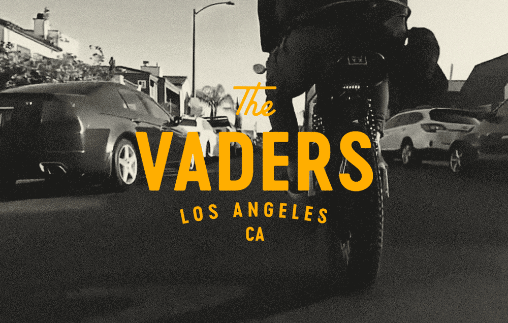
The Vaders are my friends Electric motorcycle club out of LA. I kinda went crazy on creating various different lockups that could be used in all social and merch. Also created some custom iconography/ illustrations that could be used on shirts, jackets, stickers and patches. This was a really fun project with full creative control.
A Brand Identity system I created a for Elgin Woods. Cozy dwellings built within tree canopies on densely wooded, 11 acre preserve minutes from Elgin, Texas.
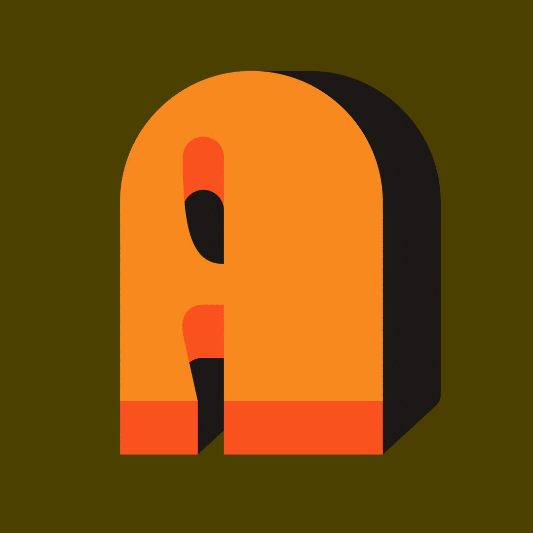
This year I finally found time to participate in 36 Days of Type.
36 Days of Type is a project that invites designers, illustrators and visual artists to express their unique interpretation of the letters and numbers of the Latin alphabet.
A yearly open call that explores the creative boundaries of letterforms by challenging participants to design a letter or number each day for 36 consecutive days. The result is a global and simultaneous act that showcases the ability to represent the same symbols from thousands of different perspectives.
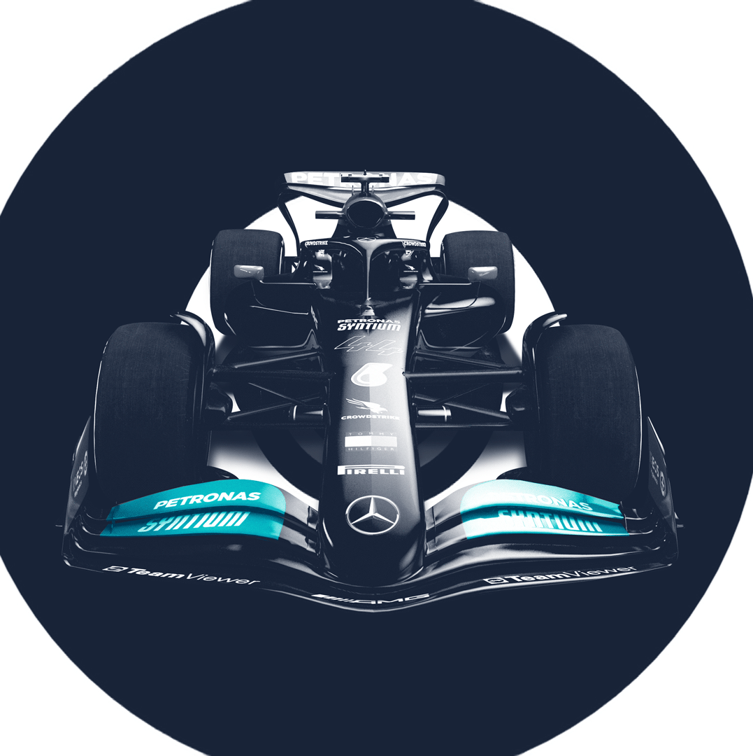
I created some graphic Poster for Mercedes Formula 1 x FTX. Hahaha, since FTX has dissolved, I thought I’d share these.
Kingsford x BB 🔥🔥🔥
I got the opportunity to work on the Collab between Ben Baller x Kingsford. All the way from Lockup to the design of the grill. I wanted this look to feel fresh, dynamic and a bit edgy. Along with the typography treatments, gold accents, and the Fire drops lockup static and animated. This was featured on the NTWRK platform and sold out within minutes.
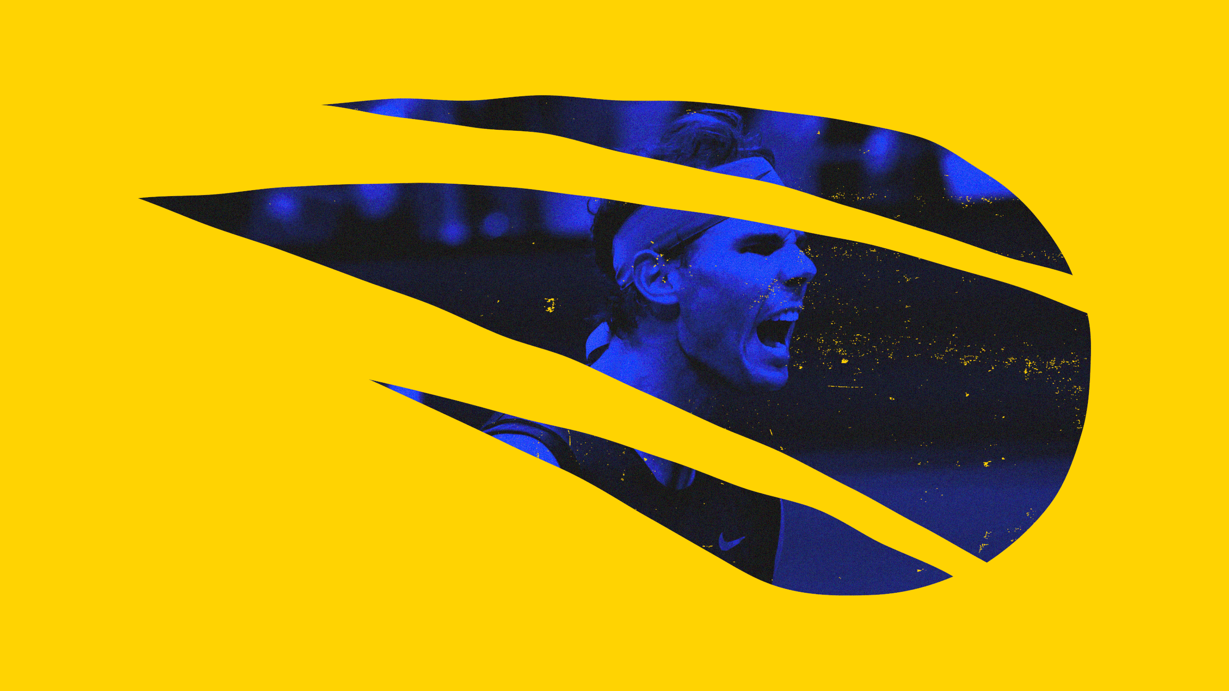
A quick hit of some various logo marks I’ve through the years.
Sed vitae enim egestas, congue arcu et, efficitur augue. Cras sit amet venenatis est. Sed pulvinar sodales lacus sit amet placerat. Nulla facilisi. Integer pellentesque semper magna vel pellentesque. Cras imperdiet tortor sit amet erat aliquet rutrum.
I was tasked to redesign the Visit Montana website.
I was tasked w/ modernizing and redesigning the Burt’s Bees iconic bee. 🐝🐝🐝🐝🐝🐝🐝
Some fun stroked out simple iconography I did for American Express. Sadly they weren't used. :( But that doesn't stop me from showing them off. ;)
̌